LOGO | BRAND IDENTITY
Logo design
A selection of projects — from complete brand identity to individual logo concepts.
Some were realised, others created as competition entries or exploratory proposals.
Hello! Bakery
Logo | brand identity | competition concept
A competition brief for the Hello! bakery chain. The colour palette was predefined — the main challenge was finding a typeface that could carry both the playfulness of the name and the demands of everyday use, from paper bags to menu boards. The proposal included a full icon system, a sample interior concept, and communication materials.
ELEGA
Logo | redesign concept
Czech leather goods brand ELEGA has been on the market since 1991 and long lacked a standalone symbol — something that could work as a discreet detail on products, the way luxury houses do. I designed a stylised swallow as an independent mark and as part of a unified logotype, deliberately retaining their existing typeface to allow for a gradual transition. The project was ultimately not realised.
CE Hub
Logo | 3 concepts
Three logo designs for the Circular Economy Hub of the Pardubice Region — an initiative connecting cities, businesses and experts on the path to a circular economy. The symbol draws on the circle as a reference to circularity and on a cluster of dots as a metaphor for connecting actors. The typeface Goodly was chosen deliberately for its rounded forms; the colours suggest collaboration and openness. The logo was not adopted — the project aligned with the existing visual identity of the P-PINK platform.
OpenSSL
Logo | 3 concepts
Three logo concepts for OpenSSL — the open-source project behind the encryption of much of internet communication. Each approach sought a different visual language for the theme of cryptography: a symbol built from lines of code stylised into the letter O, Morse code as a reminder that encryption existed long before the digital age, and a Soma Cube — a 3D puzzle as a metaphor for the building blocks of cryptography. None of the concepts was ultimately adopted.
BeneMeat Technologies
Logo | 3 concepts
Three logo designs for the then newly founded Czech biotech company Bene Meat Technologies, which focuses on the production of cultivated meat. Each concept approached the subject differently — from a geometric stylisation of an animal head to a dynamic symbol to a more illustrative treatment. The logo was not adopted; the project was put on hold and the company went in a different direction.
Business Academy Pardubice
Logo
A logo for the Pardubice Business Academy and Language School, which the school continues to use to this day. The brief was to create a modern identity that would feel neither childish nor overly conservative. The symbol is based on layered circles — a reference to goals and focus — combined with the Avenir typeface and a green accent colour. I designed the logo and the basic web layout; further print materials and CI were handled by another studio.
Allimp
Logo concept
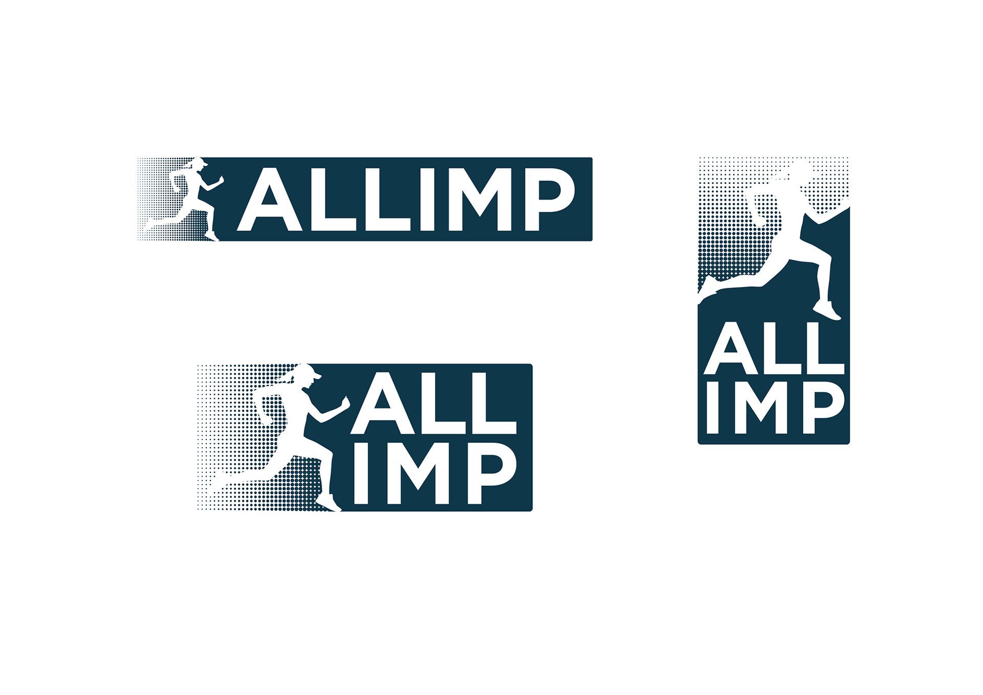
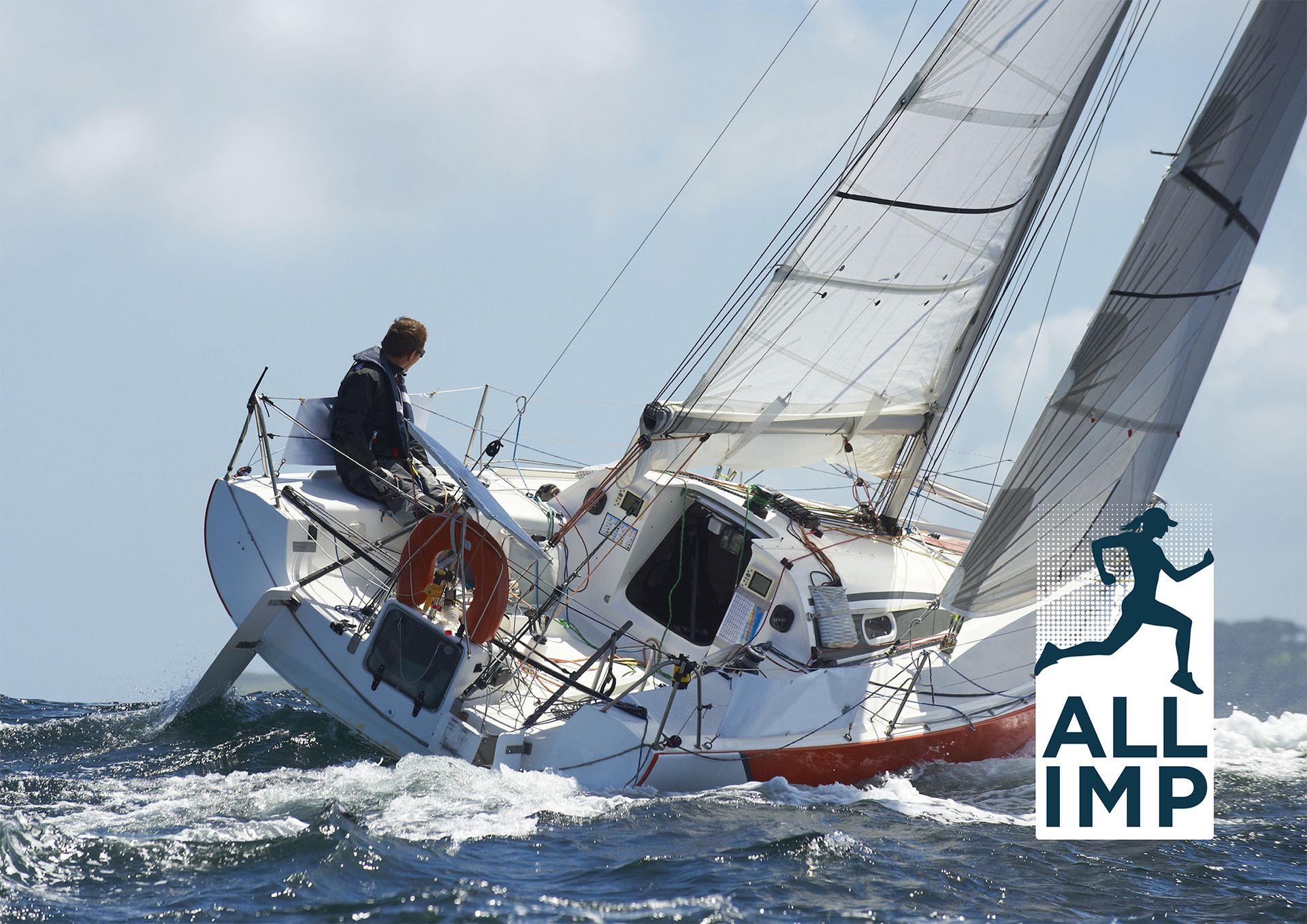
An older project — a logo for Allimp, a company developing a platform for managing health data of athletes, connecting doctors, insurers and patients with regard to the specific demands of sports healthcare. Several proposals were created, but the project was postponed and eventually handed to someone else. The version shown here is the one that best reflects my own design style — a dynamic runner silhouette with a halftone fade.


